Brand guidelines
Parcelforce Worldwide

The challenge
Parcelforce Worldwide needed a new set of guidelines to modernise and humanise the brand, particularly as their services are often sold alongside their parent company’s – Royal Mail – who had recently also undergone a new warm and fun brand refresh.
The creative
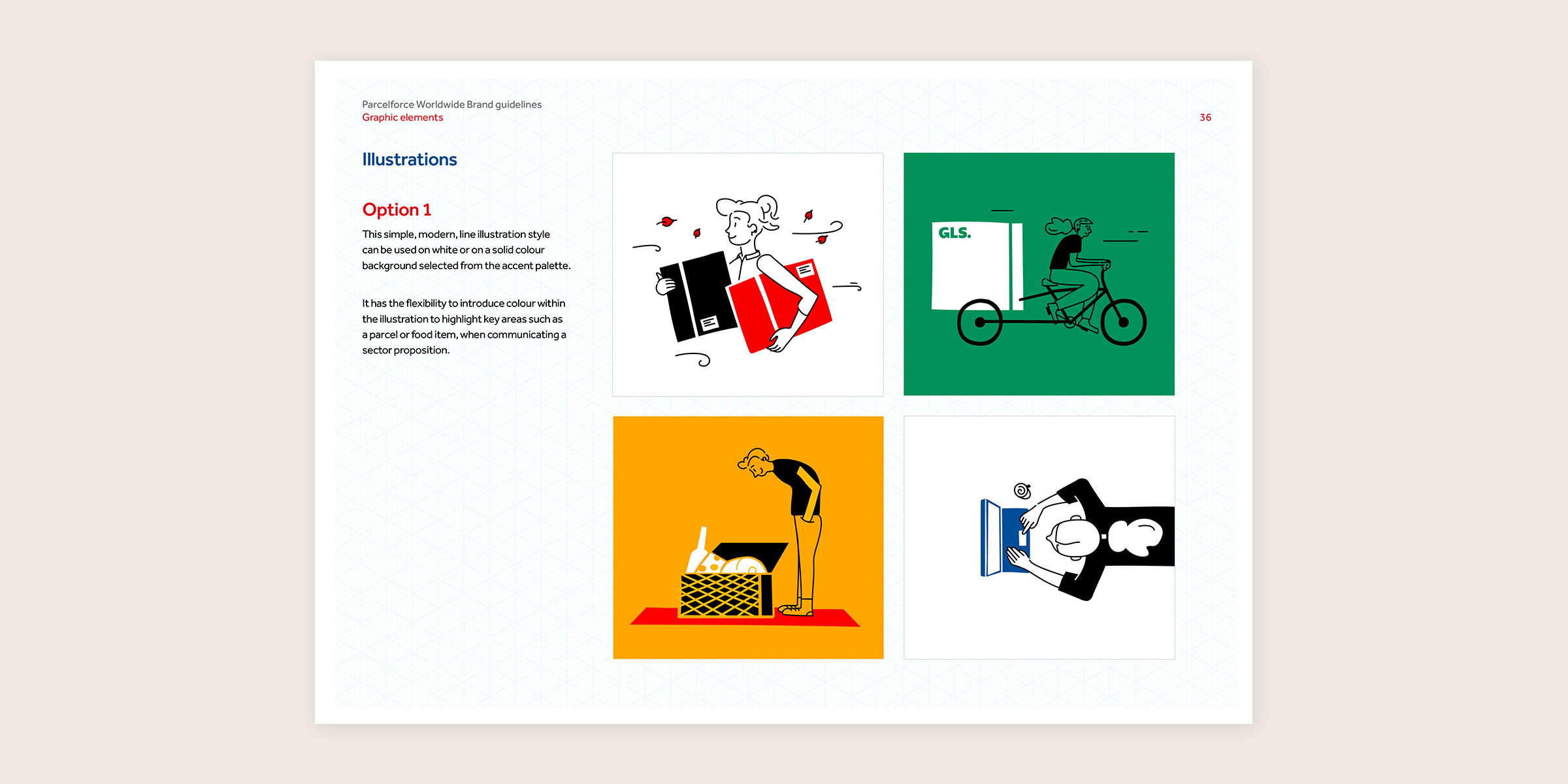
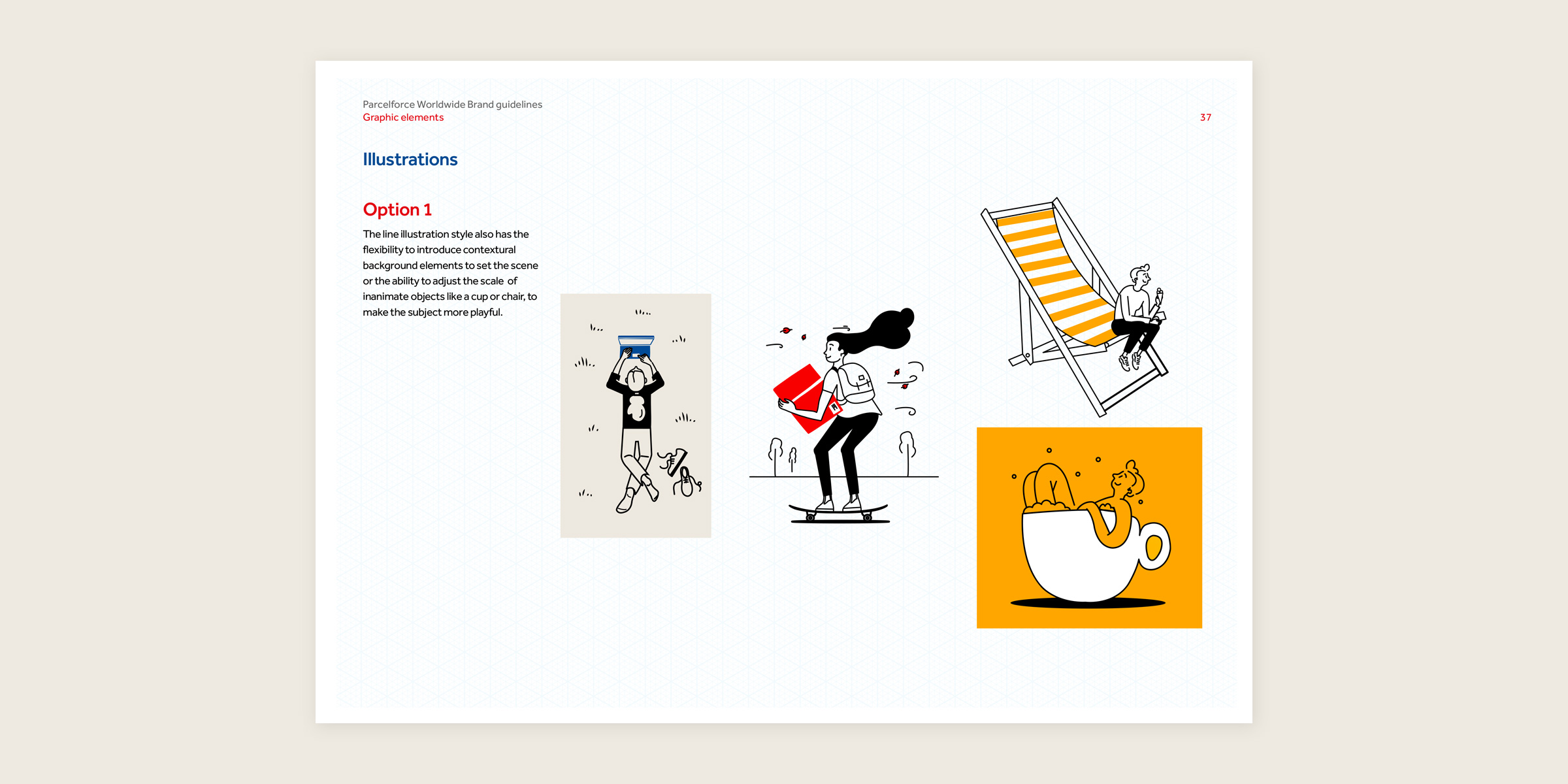
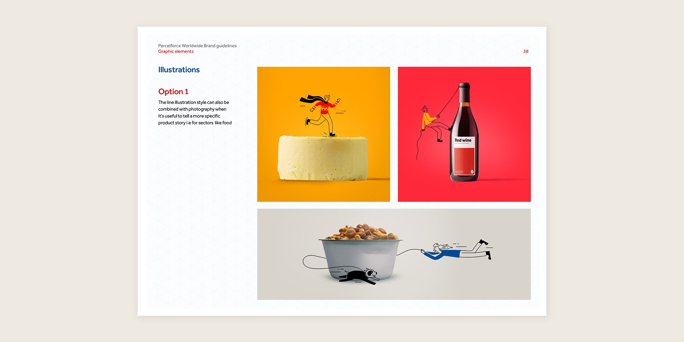
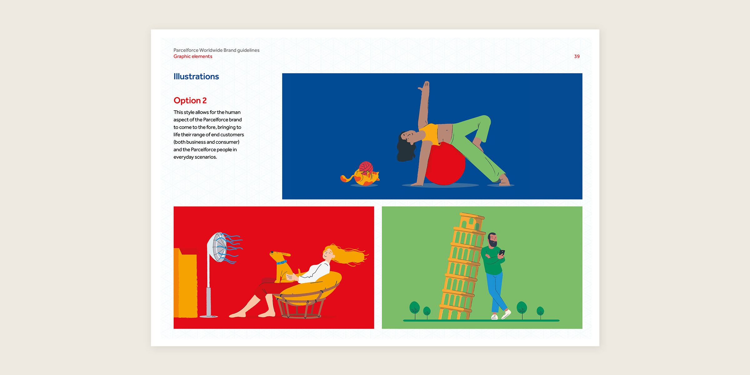
We created brand guidelines that featured an entire refresh, particularly focused around photography and illustration. We created two new illustration styles that could be used across all media, including print, digital and animation. The styles were designed in a way that could be created by their own internal team or other agencies, and could be used as part of a brand library. The photography style was focused on people, both employees and customers, to show the human side of Parcelforce. The guidelines also included updated best practice examples to showcase all the new assets and how they could be used.


The results
The guidelines were rolled out successfully and Parcelforce Worldwide’s identity has been updated to a more fun and accessible style. The brand was given warmth, and remains distinct from Royal Mail but was brought more in line so the brand styles are complementary when featured together.